Tuesday, August 28, 2018

MFT Sketch Challenge #399 & Color Challenge #100

I particularly like this fortnight’s color challenge—it’s a splendid palette for the one-hundredth challenge, and I’ve had so many ideas for how to use it. Practicality must come before sheer play, however, so I’m first applying the palette to cards for my grandmothers for Grandparents Day, which is Sunday, September 9.


Memento Toffee Crunch makes a good Kraft, and Memento Morocco stamped twice makes a good Persimmon, but I have no ink pads the right shade of blue. The closest I could get to Blue Yonder is VersaColor Atlantic, and that’s a bit too purple, and I have nothing at all near Blue Breeze. (A good range of blue ink cubes is next on my crafty wish list.) I’ve had a sheet of persimmon paper hanging around these past few weeks, hoping for a home on a card, and I found a light blue scrap of cardstock in my stash that’s near enough to Blue Breeze to round out the palette.


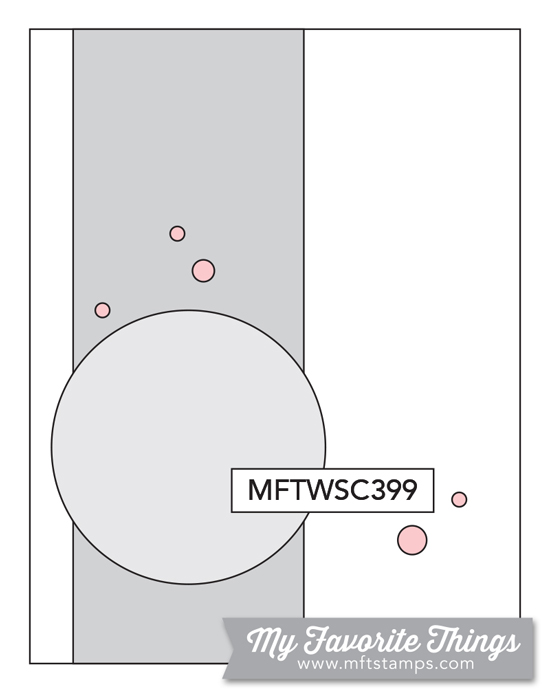
I also followed this week’s sketch challenge, and the circle element gave me a good way to ground and form the floral cluster. I’m still rubbish at arranging flowers—it takes me hours to find something that looks pleasing—but it’s so much easier to fiddle and find the right arrangement now that I have dies for them. Taking inspiration from Inge Groot and some other MFT designers, I went with white leaves, and I really like the simple silhouette look they give to a card.


Supplies
Stamps:  WPlus9 “Fresh Cut Florals”;  Hero Arts “Many Everyday Messages” (sentiment)
Dies:  WPlus9 “Fresh Cut Florals”;  My Favorite Things “Fab Foliage”, “A2 Stitched Rectangle STAX Set 1” (¾” x 2”);  Hero Arts “Nesting Circle Infinity Dies” (2.25” circle)
Ink:  VersaColor Atlantic, Smoke Blue;   Memento Morocco, Love Letter, Toffee Crunch
Paper:  Papertrey Ink Kraft, cheap light blue cardstock and persimmon origami paper from my stash
Miscellanea:  Scotch Permanent Double-Sided Tape, liquid glue

Dimensions
4.25” x 5.5”

Sunday, August 26, 2018

MFT Summer School: Monochromatic

Since I was running out of time last night to complete the second session of My Favorite Things Summer School, I abandoned my plans for a more elaborate take on a monochrome card, pulled out my dies, and whipped this up. The die-cut panel lets the colored cardstock base show through, and an auxiliary sentiment in matching ink finishes it off.


With that, I have graduated from the second session of Summer School.


Supplies
Stamps:  Hero Arts “Stamp and Cut: Hello” (sentiment)
Dies:  My Favorite Things “A2 Stitched Rectangle STAX Set 2” (4 x 5 ¼);  Hero Arts “Stamp and Cut: Hello” (sentiment)
Ink:  Hero Arts Butter Bar
Paper:  Papertrey Ink Stamper’s Select White, Lemon Tart
Miscellanea:  Scotch Permanent Double-Sided Tape, liquid glue

Dimensions
4.25” x 5.5”

MFT Summer School: Visual Triangle

For the visual triangle challenge of MFT Summer School, I balanced different colors and shapes in multiple triangles throughout a floral arrangement. There’s a triangle of purple, of coral four-petal flowers, and of one shape of stamped leaves. In a much looser sense, the Fab Foliage die-cuts behind the rectangle form a triangle as well, since they are concentrated in the top left corner, bottom edge, and right side.


This was my first chance to use the Fab Foliage dies, and I loved it. Even with only one use, I can tell that they’re well on their way to becoming a staple for me.


I’m also entering this card in MFT’s Birthday Project.


Supplies
Stamps:  WPlus9 “Fresh Cut Florals”;  Papertrey Ink “Keep It Simple: Birthday II” (sentiment)
Dies:  My Favorite Things “A2 Stitched Rectangle STAX Set 2” (1 ⅞” x 3 ⅛”), “Fab Foliage”;  WPlus9 “Fresh Cut Florals”
Ink:  Simon Says Stamp Dusty Sage;  Hero Arts Field Greens, Soft Cantaloupe, Pale Tomato;  Memento Lulu Lavender, Sweet Plum, Elderberry
Paper:  Papertrey Ink Stamper’s Select White
Miscellanea:  Scotch Permanent Double-Sided Tape, liquid glue

Dimensions
4.25” x 5.5”

Thursday, August 23, 2018

MFT Summer School: Ombré

Since I don’t have any tools for ink blending, I looked for other ways to achieve an ombré effect for the MFT Summer School challenge, but none of my outline stamps were speaking to me for the technique. Then I remembered Anja Bytyqi’s card that I had saved to my inspiration file, and that was the perfect layout—crisp, graphic, and very easy to pull together. I CASEd her card pretty closely, but I tried to change things up with different colors as well as different sentiments.


I layered the sentiment die-cuts twice for dimension, and this project persuaded me that I really do need more sentiment dies. I only have four Hero Arts Stamp and Cut words, which are small and a very loopy script, and this MFT “miss you” that I got as the free $60+ incentive with my order earlier this month. I’ve got my eye on a few of MFT’s sans serif word dies, as well as this alphabet die set from Cathy Zielske.


The strips on the blue card are ⅜” wide, and the strips on the yellow card are ½” wide, but they’re all spaced ⅛” apart from each other. The yellow stripes remind me a bit of a mug my parents had from the ’70s or ’80s—something about that deep yellow gradient seems reminiscent of the time period.


Supplies
Stamps and Dies:  My Favorite Things “miss you” die;  Hero Arts “Stamp and Cut: Joy” (die, stamp)
Ink:  Memento Morocco
Paper:  Papertrey Ink Stamper’s Select White, cheap colored paper from my stash
Miscellanea:  Scotch Permanent Double-Sided Tape, liquid glue

Dimensions
4.25” x 5.5”

Tuesday, August 21, 2018

MFT Summer School: Rainbow

For the rainbow challenge from MFT Summer School, I whipped up a super-simple graphic card. I love sans serif fonts for designs like these—really, I just love simple cards that rely entirely on a good font. My stamping platform enabled me to stamp in precise increments and make sure each word had adequate ink coverage; I’d never be able to do designs like this without a platform!


Employing the graphic design principle of using lighter colors for weightier fonts and darker colors for thinner fonts to achieve visual balance, I selectively inked the stamp in a jewel-tone rainbow on the left and a pastel rainbow on the right. I love ink cubes—full-size ink pads are so unwieldy!—but Memento’s dewdrop design is unequaled. The difference between the dewdrops and the cubes was starkly apparent using them together like this; the dewdrops offer so much more precision, and they’re much easier to grip and maneuver.


Supplies
Stamps:  Papertrey Ink “Keep It Simple: Thank You I
Ink:  Memento Teal Zeal, Grape Jelly, Lulu Lavender, Love Letter, Morocco, Peanut Brittle, Olive Grove, Pistachio;  Hero Arts Cotton Candy, Soft Cantaloupe, Butter Bar;  VersaColor Celadon, Atlantic;  Brilliance Mediterranean Blue
Paper:  Papertrey Ink Stamper’s Select White

Dimensions
4.25” x 5.5”

MFT Color Challenge #99 & The Birthday Project

The former youth pastor at my church and I happen to have the same birthday, and he was so ecstatic when he found out that he shared a birthday with someone that ever since I’ve made a point of giving him a card every year. He’s something of a comic, so this sentiment from My Favorite Things seemed quite suitable.


I’m playing along with the MFT Color Challenge #99—I jumped at the chance to use persimmon again—and I’m also entering MFT’s Birthday Project. This month’s theme is Clean and Simple, which perfectly suits my style.


Supplies
Stamps:  My Favorite Things “Hog Heaven” (sentiment);  Mama Elephant “Little Cat Agenda
Ink:  Memento Tuxedo Black
Copics:  W00, W1, W3, E43, E34, R27;  Bic Marking Sunset Orange, Moonstone Yellow
Paper:  Papertrey Ink Stamper’s Select White
Miscellanea:  Scotch Permanent Double-Sided Tape; Mama Elephant “Little Cat Agenda” dies

Dimensions
3.5” x 4.75”

Monday, August 20, 2018

MFT Summer School: Focal Point & MFT Sketch Challenge #398

This week, I’m playing along with the second session of My Favorite Things Summer School 2018. For the focal point challenge, I’m using sketch #398, since those circles provide great little windows to highlight the focal point of the card.


I backed the windows with paper I colored with the chisel end of a Copic to create subtle texture, then I popped up the front panel to create a dimensional shadow that emphasizes the focal images. Since I don’t have a realism-accurate color for the bluejay, I layered four different pigment and dye inks, using both second-generation stamping and double stamping, to get a blue that was neither too dark and bold (as it would have been if I had used only Mediterranean Blue), nor too unsaturated and grey (as it would have been if I had used only Atlantic). The birds are elevated from the front panel as well as the card base, and to create depth and visual interest I adhered the cardinal’s branch to the base but the bluejay’s branch to the front panel.


MFT Summer School 2018 Focal Point banner


Supplies
Stamps:  Papertrey Ink “Winter Woods” (birds);  Hero Arts “Stamp and Cut: Thanks” (sentiment)
Dies:  Papertrey Ink “Winter Woods” (birds, branch), “Double-Ended Banners”;  Hero Arts “Nesting Circle Infinity Dies” (1.25” circle)
Ink:  Brilliance Rocket Red, Mediterranean Blue, Graphite Black;   VersaColor Atlantic, Cyan;  Memento Teal Zeal
Copics:  BG000
Paper:  Papertrey Ink Stamper’s Select White, copy paper
Miscellanea:  Scotch Permanent Double-Sided Tape, liquid glue, Elmer’s foam mounting squares

Dimensions
4.25” x 5.5”

Sunday, August 19, 2018

PTI’s “Create Along With Us” Challenge, August 2018

My favorite card from this month’s PTI release was Lizzie’s using the “Frame It Out: Many Blessings” wreath. I was particularly smitten with the color scheme she used—I have recently discovered a fondness for persimmon, even though I don’t tend to care for oranges in general.


For my entry into the August Create Along with Us challenge, I wove together six dogwood branches from PTI’s “Spring Woods” set to create my own wreath, which ended up being a little more sprayed and star-shaped than rounded. However, I managed to get the circle even, so I’m content with it for a first attempt at a wreath.

Lizzie's card

Since I don’t have a suitable orange shade of ink, I layered a second-generation impression of Memento’s Love Letter with two first-generation impressions of Memento’s Morocco, with satisfactory results. The brown I incorporated into the branches, but since I don’t have anything resembling PTI’s Ocean Tides (such a lovely color), I opted to leave that out. I did test a branch with leaves in VersaColor Celadon, but I preferred the look of the cream leaves—more subtle, less visually distracting. Since the wreath is already so busy, I forwent a sentiment. I only glued down the center of the wreath, leaving the ends of the branches free and able to be curled up slightly for dimension and visual interest.


Supplies
Stamps & Dies:  Papertrey Ink “Spring Woods”
Ink:  Memento Morocco, Love Letter;  VersaFine Vintage Sepia
Paper:  Papertrey Ink Vintage Cream
Miscellanea:  liquid glue, paintbrush, Press’n Seal

Dimensions
5.5” x 5.5”