Showing posts with label Hero Arts. Show all posts

Wednesday, January 27, 2021

Little Agenda Valentines

February fourteenth is fast approaching, and Mama Elephant’s January card challenge has a Valentine’s Day/love theme — so why not kill two birds with one stone and get my valentines made before the last minute?

I wanted to make these quickly, so I kept my supplies minimal and the designs simple. This is my favorite of the valentines I’ve made so far; I adore the clean, graphic look and the red, black, and white color scheme.

For a hint of dimension (that the photo entirely fails to represent), I popped each die-cut circle up on two smaller cardstock circles. The card is flat enough to go through the mail safely, but it has more visual interest than if I had merely glued the die-cuts to the card base on their own.

Since I’m sending this card to a stamping friend who likes kitties, I sneaked a little crafty cat inside and another cat onto the envelope.

For the past several years, I’ve been using a wood-mounted rubber Hero Arts “created by” stamp on the backs of my cards, but when I placed a My Favorite Things order around Christmas, they enclosed a mini set of sentiments for envelopes and the backs of cards. I was hyped to find the gift in my package (it still excites me every time I pull it out of my stash), and I love how well this stamp coordinates with the card design.

For my next two valentines, I went tiny. Mini cards are my go-to for speedy designs, since I can use cute little stamps without having to figure out what to do with overwhelming white space. (Sneaky bonus: mini cards don’t have a lot of space on the inside, so there’s no pressure to fill them up with a long message — just a quick note and I’m good to go.) To add some interest to the background and keep the cards from looking too simple, I used watercolor patterned paper and built my color scheme around that.

I love the versatile designs of Mama Elephant’s Little Agenda series and how there’s almost always a stamp that will coordinate for the back of the envelope.

Again, a new stamp for the back of the card! I’ll fill it in with my name and the date when I prep the cards to mail.


Supplies
Stamps:  Mama Elephant “Little Panda Agenda,” “Little Cat Agenda,” “Little Bunny Agenda”;  The Ton “Country Rose Cluster” (“sending”);  The Stamp Market “Double Take” (“hugs”);  Lawn Fawn “Winter Alpaca” (outline mini heart), order freebie (“I Like You”);  My Favorite Things “Hand Stamped” freebie (“handmade by”; “from my ♥ to yours”)
Dies:  Hero Arts “Nesting Circles” (1 ¼” for top, ¾” for dimensional layers);  Mama Elephant “Little Panda Agenda” (coordinating)
Ink:  My Favorite Things Black Licorice dye, Hero Arts Bubble Gum, Memento Love Letter + My Favorite Things Chili Powder (layered)
Copics:  R27, R000, C00, N1, E43;  Stampin’ Up Blendabilities Melon Mambo medium
Paper:  Papertrey Ink Stamper’s Select White;  My Favorite Things Watercolor Wash 6x6 Paper Pack (light pink)
Miscellanea:  Scotch Permanent Double-Sided Tape

Dimensions
Red card: 4.25” x 5.5”
Pink cards: 3” x 4.25”

Saturday, December 14, 2019

Sledding Penguins Tag

Sandy’s Day 9 tag for Ellen Hutson’s 12 Tags of Christmas 2019 Challenge made me think of some iconic panels of Calvin and Hobbes in their wagon and the many variations of them sledding. My brother loves Calvin and Hobbes (he even has his own Hobbes stuffed animal), so I had to make a similar tag for him.


I turned a sentiment strip die into a sled, added some falling snow to the sky with a white paint pen, and emphasized the motion of the scene with snow on the sled and little dashes behind the penguins’ heads. On the back of the tag where the penguin and sled overhang the circle, I colored in the penguin with a black fineliner so he looks finished.


Supplies
Stamps:  Mama Elephant “Arctic Penguins”
Dies:  Hero Arts “Nesting Circle Dies” (3 ¼”, ⅛”);  My Favorite Things “Essential Slanted Sentiment Strips” (sled);  Lawn Fawn “Stitched Hillside Borders”;  Mama Elephant “Arctic Penguins”
Ink:  Memento Tuxedo Black, Summer Sky
Copics:  R22, R05, R27, YR02
Paper:  Papertrey Ink Stamper’s Select White, ice blue lightweight cardstock from stash
Miscellanea:  Scotch Permanent Double-Sided Tape, Gina K. Designs Connect liquid glue, Posca pen 0.7 mm white, Sakura Pigma Micron 0.45 mm black, craft knife

Simple Pine Boughs Tag

I needed a quick tag for a present I was mailing this morning, so I whipped up a simple one inspired by Lisa’s Day 3 tag for Ellen Hutson’s 12 Tags of Christmas 2019 Challenge.


Since I was coordinating the tag with some wrapping paper I have, I went ahead and made a couple others to use for other presents this season.


Supplies
Stamps:  Hero Arts “Build a Wreath by Lia”
Dies:  Hero Arts “Nesting Circle Dies” (2”)
Ink:  The Ton Found Topaz;  My Favorite Things Dill Pickle
Paper:  Michael’s Recollections “Seaside” pack 65 lb. cardstock

Thursday, December 12, 2019

Holly Jolly Unicorn Tag

This year, I’m participating in Ellen Hutson’s 12 Tags of Christmas 2019 Challenge for the first time. I’ve got a couple of other tag designs roughly sketched out, but this month has been so crazy that I haven’t yet had the time to sit down and make them. The design for this tag, however, leapt into being pretty easily — it was inspired by Carly’s tag for Day 10. I liked her circular base, the candy-like colors she chose, and her use of holly.


For my tag, I went for a pepperminty color scheme with cool, minty greens, a pink-toned red, and lots of white. Arranging the sentiment took way longer than I’d like to admit, but I’m satisfied with how it turned out — definitely worth all those scraps of paper I consumed while testing iterations.

I originally intended to make a pile of presents for the unicorn to be standing among, but that didn’t work with the circular card, so I ended up going with a wreath of presents and holly in a scaled-down echo of Carly’s. Rather than stamping the unicorn and presents in black ink, which would have been very stark against the white areas, I used a dark purple, which adds to the cool tones present in the rest of the design. Adding dimension to the white body with a purple marker, instead of just grey, further boosted the candy-like wintry feel. I covered all the white surfaces of the unicorn with a shimmer pen, and for once I think my camera managed to capture it decently.


The pearly shimmer pigment ink I used to stamp the sparkles and snowflakes is somewhat opaque, but it has almost no color to it, which makes it impossible to see on white paper unless the light hits it just right. I wanted the sparkles and snowflakes to fill in the space, not just hint at glimmer, so I first stamped Fairy Dust ink three times to get a light cool grey, then layered Platinum Planet on top of it, muting the grey color and leaving the shapes pale but clearly defined. Although the sparkles and snowflakes don’t show up well in the photos, they’re perfectly visible in person.


I almost forgot to stamp the back of the tag, and then I had to scramble to see if I even had any “to/from” stamps to stamp it with! Somehow, I only have these two, so they’ll be getting a workout if I can make the time to create more tags. Do you have any good “to/from” stamp sets to recommend?


Supplies
Stamps:  Lawn Fawn “A Little Sparkle” (unicorn, sparkles), “Winter Alpaca” (snowflakes), “Year Five” (present);  Hero Arts “Build a Wreath by Lia” (holly);  Papertrey Ink “City Scene Christmas Sentiments” (“merry & bright”);   Clearly Besotted Simple Silhouettes (“to,” “from”)
Dies:  Hero Arts “Nesting Circle Dies” (3 ¼”);   Lawn Fawn “A Little Sparkle”
Ink:  Memento Elderberry, Brilliance Platinum Planet;  The Ton Caribbean Turquoise;  Hero Arts Pale Tomato;  WPlus9 Fairy Dust
Copics:  R27+R22 (cheek, rear present), V20+C00 (body shadows), BG32 (hooves and ear);  Sharpie Mint (mane, tale, presents), Turquoise (mane and tail);  Stampin’ Up Blendabilities Costal Cabana medium (mane and tail)
Paper:  Papertrey Ink Stamper’s Select White
Miscellanea:  Zig Two-Way Glue Pen, Spectrum Noir Clear Sparkle pen, hole punch

Tuesday, March 5, 2019

National Pig Day & MFT Sketch Challenge #426

Obscure holidays are the perfect excuse for surprising people with cards, and March 1 was National Pig Day. My little sister has been a pig fanatic since she was eighteen months old and met a pot-bellied pig in person, so I whipped up a clean-and-simple card for her.


While brainstorming the card design, I checked this week’s MFT’s sketch challenge to see if I could incorporate it. I adored Anna’s card—everything about the placement of her elements delights me—so I kept it up for inspiration, pulled out the cutest new pig stamps, and set to work.

I didn’t want to take the time to blend or stamp a background, so I grabbed my brand new Watercolor Wash paper pad and chose a blue that coordinated with the cobalt color scheme. This is my first MFT 6x6” paper pack, and the paper surprised me by how thick and sturdy it is. It feels at least twice the weight of the various 12x12” patterned papers I have, and it’s wondrously smooth. It made creating a background a snap, too, so now I’ll be torn between conserving the good paper and wanting to use it every chance I get. It’d be great if MFT came out with a watercolor pad solely in blues and greens; I foresee using this primarily for sky, grass, and backgrounds, and there are only two sheets per color, so a pack with a dozen sheets of blue would be fantastic.


Since the alphabet set I used to create the interior sentiment doesn’t have an apostrophe and I couldn’t bear to let the card leave my hands with an improperly punctuated contraction, I added in the apostrophe with a gel pen in a blue that almost exactly matched The Ton’s Azurite ink. I have this line of Japanese pens in a variety of colors, and I love using them to write notes inside cards and to address envelopes. Although they’re hard to find and not cheap, their line weight is half the size of that of the typical American gel pen (0.38 mm instead of 0.7 or 1.0 mm), and their ink flow is incredibly smooth. I’m a wholehearted stationery geek, and the Signo DX is my all-time favorite gel pen.


Supplies
Stamps:  Hello Bluebird “Farmyard Little Bits”;  Hero Arts “Many Everyday Messages” (sentiment);  Mama Elephant “Bella Letters” (interior sentiment)
Dies:  My Favorite Things “Essential Slanted Sentiment Strips,” “A2 Stitched Rectangle STAX 1”;  Hello Bluebird “Farmyard Little Bits”
Ink:  The Ton Azurite;   Memento Espresso Truffle
Copics:  R000, R20, B26
Paper:  Papertrey Ink Stamper’s Select White, My Favorite Things Watercolor Wash 6x6” Paper Pack (light blue)
Miscellanea:  Scotch Permanent Double-Sided Tape, Gina K. Designs Connect Glue, Uni Posca paint marker (0.7 mm white), Uni-ball Signo UM-151 (aka Signo DX) (0.38 mm blue)

Dimensions
4.25” x 5.5”
Tuesday, January 29, 2019

MFT Sketch Challenge #421

Every two weeks or so, I send a card to my grandmother, and this week I finally broke out the butterfly stamps that I got for Christmas—she adores butterflies, so I knew it would be an especially nice surprise. When I checked My Favorite Things’ sketch challenge, the simple layout of this week’s sketch appealed to me, and I immediately saw how to incorporate a butterfly.

I also jumped at the chance to use some patterned paper from my stash. I adore the nature patterns in the Affinity patterned paper pack, but since it’s a 12x12” pad, I rarely have opportunities to use it. (I should have gotten the 6x6” pad, but back in my younger and more ignorant days, I thought that the patterns were the same size and I was just getting more paper. Alas no, younger self: the patterns are scaled.)


I also used another item from Christmas: a blending brush. With one of my gift-cards, I bought a ten-pack of cheap makeup brushes from Amazon for about $10, shipped from China. Since I had never tried ink blending before, I didn’t know if I’d like it or be good at it or use it much, so I didn’t want to drop fifty bucks on the Picket Fence Studios Life-Changing blending brushes. The makeup brushes are essentially the same thing, but at a much more accessible entry price—not a big investment if I ended up deciding that I wouldn’t use the technique much. They worked well, however, and although it took me a few practice runs on scrap paper to figure out how to ink-blend, I’m pleased with the results. Getting an even blend was easy, and the ink didn’t splotch at all, even though I was using dye inks that are said to be difficult to blend (at least compared to the two Distress Ink lines). The Life-Changing brushes are reputedly a higher quality, so if these don’t hold up well I might invest in those later. Already, half of one small brush-head came unglued and fell out while I was rinsing it, but I had used rather a lot of water; the larger brushes have stayed intact.


For my very first time blending, I don’t think I did half bad, but I learned a lot, too, and look forward to improving. I originally intended the focal circle to be softer and fade out at the edges, but after laying the mask down and starting to fill in color, I kind of forgot. I was aiming for an even blend and a slight dark-to-light gradient, which I achieved, but at the expense of that soft, glowy circle. The hard edges were difficult to discern since the ink colors were so light in general, and I didn’t realize how much color I had laid down until I peeled back the mask and went, “Whoops.” Now that I have a better idea of what I’m doing, I’d like to try the same type of focal area again and aim for faint edges that blend out into the cardstock.


As is my wont, I stamped a matching envelope and wrote the address in a coordinating gel pen (I swear by the Uni-ball Signo UM-151), and I dropped the card in the mailbox this morning.


Supplies
Stamps:  The Ton “Beautiful Butterflies 1”;  Hero Arts “Many Everyday Messages” (sentiment)
Dies:  The Ton “Beautiful Butterflies 1”;  Hero Arts “Nested Circle Infinity Dies”;  My Favorite Things “Essential Slanted Sentiment Strips
Ink:  Memento Tuxedo Black, Morocco;  My Favorite Things Dye Peach Bellini;  Hero Arts Butter Bar
Copics:  R05, YR02;  Blendabilities Pumpkin Pie medium and light
Paper:  Papertrey Ink Vintage Cream, The Paper Studio Affinity patterned paper pack
Miscellanea:  Scotch Permanent Double-Sided Tape, Gina K. Connect Glue, unbranded makeup brush (like “Life-Changing Blending Brushes”), Post-It Removable Labeling Tape

Dimensions
4.25” x 5.5”

Sunday, August 26, 2018

MFT Summer School: Monochromatic

Since I was running out of time last night to complete the second session of My Favorite Things Summer School, I abandoned my plans for a more elaborate take on a monochrome card, pulled out my dies, and whipped this up. The die-cut panel lets the colored cardstock base show through, and an auxiliary sentiment in matching ink finishes it off.


With that, I have graduated from the second session of Summer School.


Supplies
Stamps:  Hero Arts “Stamp and Cut: Hello” (sentiment)
Dies:  My Favorite Things “A2 Stitched Rectangle STAX Set 2” (4 x 5 ¼);  Hero Arts “Stamp and Cut: Hello” (sentiment)
Ink:  Hero Arts Butter Bar
Paper:  Papertrey Ink Stamper’s Select White, Lemon Tart
Miscellanea:  Scotch Permanent Double-Sided Tape, liquid glue

Dimensions
4.25” x 5.5”
Thursday, August 23, 2018

MFT Summer School: Ombré

Since I don’t have any tools for ink blending, I looked for other ways to achieve an ombré effect for the MFT Summer School challenge, but none of my outline stamps were speaking to me for the technique. Then I remembered Anja Bytyqi’s card that I had saved to my inspiration file, and that was the perfect layout—crisp, graphic, and very easy to pull together. I CASEd her card pretty closely, but I tried to change things up with different colors as well as different sentiments.


I layered the sentiment die-cuts twice for dimension, and this project persuaded me that I really do need more sentiment dies. I only have four Hero Arts Stamp and Cut words, which are small and a very loopy script, and this MFT “miss you” that I got as the free $60+ incentive with my order earlier this month. I’ve got my eye on a few of MFT’s sans serif word dies, as well as this alphabet die set from Cathy Zielske.


The strips on the blue card are ⅜” wide, and the strips on the yellow card are ½” wide, but they’re all spaced ⅛” apart from each other. The yellow stripes remind me a bit of a mug my parents had from the ’70s or ’80s—something about that deep yellow gradient seems reminiscent of the time period.


Supplies
Stamps and Dies:  My Favorite Things “miss you” die;  Hero Arts “Stamp and Cut: Joy” (die, stamp)
Ink:  Memento Morocco
Paper:  Papertrey Ink Stamper’s Select White, cheap colored paper from my stash
Miscellanea:  Scotch Permanent Double-Sided Tape, liquid glue

Dimensions
4.25” x 5.5”

Thursday, July 12, 2018

MFT Summer School: White Space

For the first challenge of My Favorite Things Summer School, white space, I knew exactly what I wanted to do. Last Christmas, the cards I made with the word die from the Hero Arts “Stamp and Cut: Joy” set left me with a bunch of petal-shaped gold pieces from cutting the negative space inside the loops of the letters, and I’d been meaning to make a flower with them. My grandmother’s birthday is in a few weeks, and a simple, gold-and-cream flower card seemed just the thing.


It took me a few iterations to figure out how to arrange the petals in the most appealing way, and the layout feels a little too empty, but there weren’t enough leftover pieces to make a second, smaller flower. I probably would have been better off making the design symmetrical on a vertical layout, but I really liked the notion of having the flower in the lower right. A scattering of sequins might help balance the layout, but I haven’t a sequin or rhinestone to my name, so spare and simple it shall be.


With this, my fifth project, I have completed all of the challenges from the first session of My Favorite Things Summer School 2018.


Supplies
Stamps:  Papertrey Ink “Keep It Simple: Birthday II” (sentiment)
Ink:  Brilliance Galaxy Gold
Paper:  Papertrey Ink Vintage Cream (base), Recollections “Paper Flowers” cardstock pack (gold cardstock)
Miscellanea:  liquid adhesive

Dimensions
4.25” x 5.5”

Tuesday, July 10, 2018

MFT Summer School: Symmetry

I love super simple cards like this one by Ellenor Emilsson, so for the fifth challenge of My Favorite Things Summer School, symmetry, I went about as simple as possible. Since I was going to color with Copics and anticipated bleed-through, I stamped the image on a panel that I adhered to my card base after coloring. However, the tiny size of the flowers meant that the markers barely bled at all, so I could have made this a true one-layer card.


Since the card was so simple, it only seemed right to add a touch of shimmer.


Supplies
Stamps:  My Favorite Things “Hog Heaven” (flowers), Hero Arts “Stamp and Cut: Hello” (sentiment)
Ink:  Memento Tuxedo Black
Copics:  R22, G12, YG45
Paper:  Papertrey Ink Stamper’s Select White
Miscellanea:  Scotch Permanent Double-Sided Tape, Spectrum Noir Sparkle clear

Dimensions
4.25” x 5.5”

Monday, July 9, 2018

MFT Summer School: Primary Colors

For the second challenge of the My Favorite Things Summer School, I used varied shades of primary colors to give the image more visual interest than it would have had if I had used markers with the same bright saturation. A lighter red value helped keep the color scheme from seeming juvenile, and a dark yellow took the place of orange for the beaks.


Since Memento Tuxedo Black ink isn’t an intense black and I was using a wood-mounted rubber stamp and couldn’t ink the image twice, after I colored the birds I went over the lines again with fineliners to darken the outlines and give the image more definition. To finish off the card, I added a bit of shimmer to the heart.


In addition to submitting this to the MFT Summer School: Primary Colors category, I’m linking up to Simon Says Stamp’s Wednesday challenge “Red, White, and/or Blue.”


Supplies
Stamps:  Stampin’ Up “For the Birds” (image), Hero Arts “Stamp and Cut: Hello” (sentiment)
Ink:  Memento Tuxedo Black
Copics:  R22, R27; Bic Yellow Blaze, Moonstone Yellow, Blue Skies Blue
Paper:  Papertrey Ink Stamper’s Select White
Miscellanea:  Scotch Permanent Double-Sided Tape, Pigma Micron 0.45 and 0.25, Spectrum Noir Sparkle clear

Dimensions
Card: 4.25” x 5.5”
Panel: 2” x 3”

Sunday, May 20, 2018

PTI’s “Create Along With Us” Challenge, May 2018

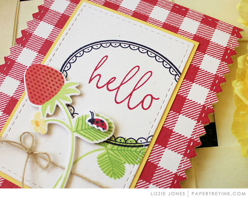
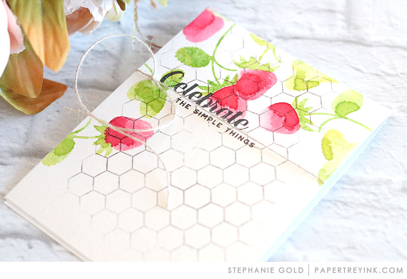
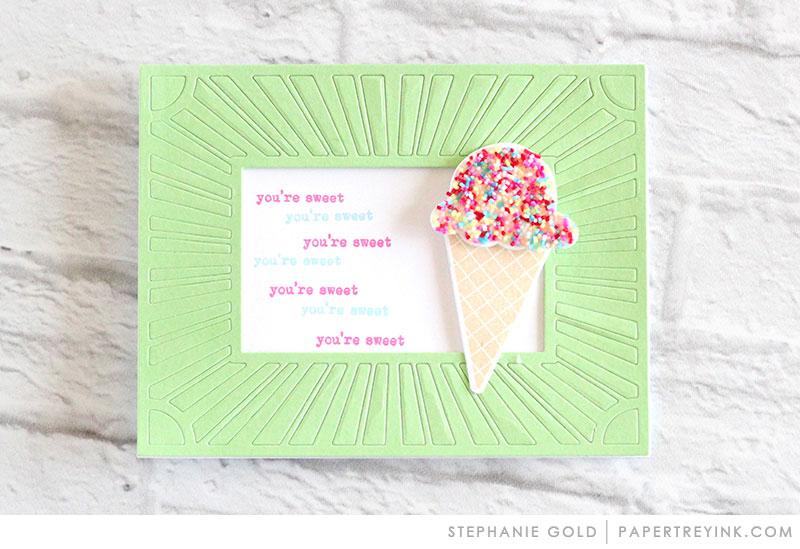
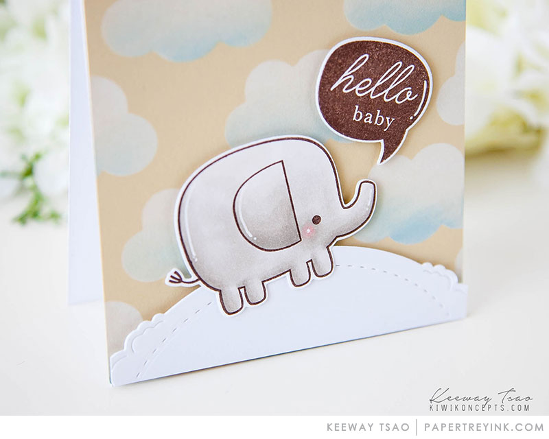
A bunch of cards in Papertrey Ink’s release blog posts this month caught my eye, and when the May Create Along With Us challenge started, I thought, “Why not?” I only managed to make translations of four of the seven cards that I’d saved as inspiration images: limited supplies and lack of time intervened. In the future, I’d like to attempt several iterations of Lizzie’s rainbow stripe star card; its clean, graphic look appealed to me the most out of the cards from this release, and I have several ideas for how to translate it into my own supplies.


I also loved the look of Lizzie’s red and yellow strawberry card, but I didn’t have any patterned paper or stamps that remotely resembled her supplies, so I condensed the elements of her card to their essence: red and white accented by yellow and green, several layers of frames, and a focal image framed in black. The framed image in PTI’s “Spring Hills” set perfectly fit the parameters, and I built the card around it. Since my Copic collection is limited, I didn’t have a suitable yellow-green, and the one lime marker available entirely washed out my yellow Copic, so I went with a more true green for contrast. Putting the focal image on a solid red base looked too flat, so I masked off a piece of cardstock in a plaid pattern and went over it with the same red Copic I had used for the roof of the house.


Stephanie’s simple, graphic strawberries card was my most direct translation, since I could very nearly match the colors and main font she used. I love the look of strawberries but don’t have any strawberry stamps yet, so I went with a flower silhouette and leaves and followed the layout of Stephanie’s card. Since I didn’t use the watercolor technique, the result isn’t as loose and organic as hers, but the graphic layout pleases me.


Stephanie’s fun mint and sprinkles card provided the perfect excuse for me to use my new sprinkle washi tape. This card was the quickest and easiest to make, though the result is much simpler than Stephanie’s since I don’t have coverplate dies or any large image that would coordinate with the theme. Instead, I focused on the color scheme and the theme.


Keeway’s cute little animal card I used primarily as a sketch, since I haven’t any elephant or cloud stamps, but I do have a bunch of adorable little animals. I cut a peach panel to A1 size and layered on a hillside border, the cutest and chubbiest critter I could find, and a sentiment from PTI. The result feels a tad too simple, and it’d look better with some clouds, but one must work with what one has. Cloud dies have jumped much higher on my wish list, though!


Supplies
Stamps:  Papertrey Ink “Keep It Simple: Thank You I” (bold script), “Spring Hills” (framed hillside), “Just Desserts Sentiments” (“everything’s better...”), “Winter Woods” (“hello”);  WPlus9 “Fresh Cut Florals” (flower and leaves);  Hero Arts “Stamp and Cut: Thanks” (“for your kindness”);  Mama Elephant “Lunar Animals” (cow)
Ink:  Memento Tuxedo Black, Espresso Truffle;  VersaFine Vintage Sepia;  Hero Arts Pale Tomato, Green Hills, Bubble Gum;  VersaColor Cyan
Copics:  R27, Y00, G14, BG000, W00, and E43 (framed hillside); E34, E30, E0000 (cow);  Stampin’ Up Stampin’ Blendabilities: Crumb Cake Light, Crumb Cake Medium (cow)
Paper:  Papertrey Ink Stamper’s Select White; cheap layering-weight yellow, mint, and peach from stash
Miscellanea:  Scotch Permanent Double-Sided Tape, Pebbles Happy Hooray Birthday Wishes washi tape, Lawn Fawn “Stitched Hillside Borders” dies


Dimensions
All cards:  4.25” x 5.5”

Saturday, April 21, 2018

Small Trio Layout

Eight whole years have passed since I last posted something here — thank goodness for Blogger’s “revert to draft” feature, or I’d have to delete this blog and start afresh. As things are, I have a nook already prepared where I can publish a little something if I have a mind to share it with the internet. I don’t expect to publish with any regularity, but posting here will, I believe, be easier than trying to use photo site links, so here I shall be.

The reason for this resuscitation? Susan recently posted a lovely card with a color scheme and layout that appealed to me so much that I wanted to mimic it immediately. That was not to be, however: freelance work comes in either a trickle or a deluge, and that week I had more work than I usually see in a month. Card-making was sidelined to such an extent that I forgot about my desire to CASE Susan’s card. When she replied to my comment on Monday, I was just catching my breath after the deluge, and the impulse to craft struck so hard that I sat down immediately and pulled out my stamps and ink.

"Thinking of You" in Nautical Blue, Vanilla, and Peanut Brittle

Another deluge week is falling about my ears now (April was this busy last year, too — something in the air, maybe?), but in the six intervening days I’ve produced five cards, which is a pretty high average for me. Perfectionist that I am, I usually spend about three days on a single card, working on a couple elements each day (planning the layout, testing and selecting colors, stamping and coloring the focal element, creating the base, and assembling the components). But why make only one card if you can make two at once?

"Sending Springtime Smiles" in Soft Cantaloupe, Celadon, and Cyan

Although I don’t have any of the exact stamps that Susan used, I do happen to have a set that contains a bird, a dragonfly, and a butterfly, which made emulating easy. The text background — the main theme of her card — I had to improvise, since I don’t yet have a script background stamp. The larger and more legible words required a more subtle ink, and I realized early on that I couldn’t just stamp whole sentiments across the squares. Figuring out how to stamp selectively inked words around the focal images in a way that looked halfway decent took me longer than I’d care to admit, and I still goofed a few times on the final product. The vanilla ink was forgiving; the cyan, less so. While inking the edges of the cantaloupe dragonfly panel, I dropped it onto my ink pad. There wasn’t any way to salvage the panel without starting over, so I’m just considering it a little extra distressed.

Verdict: This was my first time truly CASEing anything, and it was a good learning experience. For the most part, I enjoyed the process, but I won’t be doing text backgrounds again until I get a background stamp! The selective inking is too time-consuming to employ frequently.

Supplies
Stamps:  Papertrey Ink “Happy Trails” (images and background words), “Spring Hills” (“sending springtime smiles”);  Hero Arts “Many Everyday Messages” (“thinking of you”)
Ink:  Memento Nautical Blue, Peanut Brittle;  VersaColor Vanilla, Celadon, Cyan;  Hero Arts Soft Cantaloupe
Paper:  Papertrey Ink Stamper’s Select White
Miscellanea:  Scotch Permanent Double-Sided Tape

Dimensions
Cards:  6.75” x 4.5”
Squares:  1.5” x 1.5”