Showing posts with label WPlus9. Show all posts

Monday, September 10, 2018

MFT Sketch Challenge #401

A couple of weeks ago, I spotted this card by Larissa Heskett and fell in love with the color scheme. My sister’s birthday is approaching, and she loves pandas, so making her a card provided the perfect excuse for CASEing Larissa’s. This week’s sketch challenge from My Favorite Things suited the layout I had in mind, and I’m also submitting the card to MFT’s Birthday Project.


I stamped the flowers multiple times, two layers for the orange, three or four for the yellow, because I wanted deep colors as well as a solid impression to capture the details of the flowers. I drew in the stems and am not happy with them—it’ll be a while before I can freehand anything satisfactorily. Whatever I draw never quite conforms to the law of gravity, and the lack of realism bugs me, but the only way to improve is to practice, so I’m continuing my attempts and trying to convince myself that the wonky results are just going to look whimsical to anyone else.

I edged the matte in the same orange ink, just smooshing the cube onto the paper. The cheaper cardstock rippled a little as it dried, but my dictionary helped mitigate that somewhat, and the focal panel disguises the remaining undulations.


Supplies
Stamps:  Mama Elephant “Incoming Mail” (panda);  WPlus9 “Fresh Cut Florals”;  Papertrey Ink “Keep It Simple Birthday III” (sentiment)
Dies:  My Favorite Things “A2 Stitched Rectangle STAX Set 1”
Ink:  Memento Tuxedo Black;  My Favorite Things Dye Persimmon;  Hero Arts Butter Bar
Paper:  Papertrey Ink Stamper’s Select White, cheap lightweight white cardstock from my stash
Miscellanea:  Scotch Permanent Double-Sided Tape, Sakura Pigma Micron 01 (0.25 mm)

Dimensions
4.25” x 5.5”

Tuesday, August 28, 2018

MFT Sketch Challenge #399 & Color Challenge #100

I particularly like this fortnight’s color challenge—it’s a splendid palette for the one-hundredth challenge, and I’ve had so many ideas for how to use it. Practicality must come before sheer play, however, so I’m first applying the palette to cards for my grandmothers for Grandparents Day, which is Sunday, September 9.


Memento Toffee Crunch makes a good Kraft, and Memento Morocco stamped twice makes a good Persimmon, but I have no ink pads the right shade of blue. The closest I could get to Blue Yonder is VersaColor Atlantic, and that’s a bit too purple, and I have nothing at all near Blue Breeze. (A good range of blue ink cubes is next on my crafty wish list.) I’ve had a sheet of persimmon paper hanging around these past few weeks, hoping for a home on a card, and I found a light blue scrap of cardstock in my stash that’s near enough to Blue Breeze to round out the palette.


I also followed this week’s sketch challenge, and the circle element gave me a good way to ground and form the floral cluster. I’m still rubbish at arranging flowers—it takes me hours to find something that looks pleasing—but it’s so much easier to fiddle and find the right arrangement now that I have dies for them. Taking inspiration from Inge Groot and some other MFT designers, I went with white leaves, and I really like the simple silhouette look they give to a card.


Supplies
Stamps:  WPlus9 “Fresh Cut Florals”;  Hero Arts “Many Everyday Messages” (sentiment)
Dies:  WPlus9 “Fresh Cut Florals”;  My Favorite Things “Fab Foliage”, “A2 Stitched Rectangle STAX Set 1” (¾” x 2”);  Hero Arts “Nesting Circle Infinity Dies” (2.25” circle)
Ink:  VersaColor Atlantic, Smoke Blue;   Memento Morocco, Love Letter, Toffee Crunch
Paper:  Papertrey Ink Kraft, cheap light blue cardstock and persimmon origami paper from my stash
Miscellanea:  Scotch Permanent Double-Sided Tape, liquid glue

Dimensions
4.25” x 5.5”

Sunday, August 26, 2018

MFT Summer School: Visual Triangle

For the visual triangle challenge of MFT Summer School, I balanced different colors and shapes in multiple triangles throughout a floral arrangement. There’s a triangle of purple, of coral four-petal flowers, and of one shape of stamped leaves. In a much looser sense, the Fab Foliage die-cuts behind the rectangle form a triangle as well, since they are concentrated in the top left corner, bottom edge, and right side.


This was my first chance to use the Fab Foliage dies, and I loved it. Even with only one use, I can tell that they’re well on their way to becoming a staple for me.


I’m also entering this card in MFT’s Birthday Project.


Supplies
Stamps:  WPlus9 “Fresh Cut Florals”;  Papertrey Ink “Keep It Simple: Birthday II” (sentiment)
Dies:  My Favorite Things “A2 Stitched Rectangle STAX Set 2” (1 ⅞” x 3 ⅛”), “Fab Foliage”;  WPlus9 “Fresh Cut Florals”
Ink:  Simon Says Stamp Dusty Sage;  Hero Arts Field Greens, Soft Cantaloupe, Pale Tomato;  Memento Lulu Lavender, Sweet Plum, Elderberry
Paper:  Papertrey Ink Stamper’s Select White
Miscellanea:  Scotch Permanent Double-Sided Tape, liquid glue

Dimensions
4.25” x 5.5”

Monday, July 9, 2018

MFT Summer School: Complementary Colors & MFT Sketch Challenge #392

This week, I’m participating in the My Favorite Things Wednesday Sketch Challenge #392 as well as the first 2018 session of MFT Summer School.

The fourth Summer School challenge is to use complementary colors. Everyone else seemed to be using bright primary and secondary colors for their complementary pair, but the range of complementary colors covers so much more than just those six, and I wanted to do something different. I gravitate towards tertiary and quaternary colors, earth tones, and desaturated colors, so I tackled the project with those in mind. I pulled up a color wheel and messed around with combinations, tones, and shades for a while, then narrowed down my options.

My ink and marker selection is fairly limited still and tends towards the brighter end of the spectrum, which didn’t suit the vibe I was going for, and the sketch seemed like a good way to use a bit of my profusion of 12x12 patterned paper. I bought several pads online years ago and only realized when they arrived that the reason stores sell 6x6 pads is because 12x12 patterns are enormous and don’t usually fit on A2 card fronts. Online, there was no indication that the pattern scale differed; I thought I was just getting more paper! Now I don’t know if I shall ever use it up.

In flipping through my paper pads, I was smitten with the notion of pairing a dark, desaturated red floral pattern with the green as well, so I went ahead and made two cards, using the patterned paper first as a prototype to figure out what I wanted to do with the sketch.


For the second card and my main complementary color pair, I chose dark red-violet and light yellow-green, then threw in a bit of gold since the papers read more purple and green together. I broke out my VersaMark cube and created my own tone-on-tone floral pattern, and since I had a better idea of what I wanted out of the layout, I was able to simplify things more to my tastes.


Supplies
Stamps:  Papertrey Ink “Happy Trails” (“just a note”), WPlus9 “Fresh Cut Florals” (“thinking of you”), Stampin’ Up “I Like You” (flowers)
Ink:  Brilliance Galaxy Gold, VersaMark
Paper:  Papertrey Ink Vintage Cream (bases), The Paper Studio “Affinity” pattern paper pack and “Affinity” textured paper pack, Stampin’ Up Blackberry Bliss, Recollections “Paper Flowers” cardstock pack (gold cardstock), cheap layering-weight cream and dark red from stash
Miscellanea:  Scotch Permanent Double-Sided Tape, Papertrey Ink “Double-Ended Banners” die

Dimensions
4.25” x 5.5”

Monday, July 2, 2018

Sweet Birthday Florals

A friend of mine has a birthday this week, and this card is already on its way to her.


I took inspiration for the color scheme from her Tumblr and her artwork, and I chose these clustered blooms since they were the closest thing I had to hydrangeas, which are some of her favorite flowers. Since I don’t have the dies for this set (yet!), I had to mask the flowers. I’m not very good at arranging florals yet, and it’s particularly difficult without die-cuts, so I kept things simple. The masking left a white halo around some of the images, so I used a cotton swab cut down to a point and smushed on my ink pad to dab color into the gaps.

The pitcher is from an entirely different floral set by Clearly Besotted. I stamped it once in Simon Says Stamp Fog ink, which isn’t Copic-friendly, so the outline blurred a little when I colored in the pitcher with the lightest warm gray Copic. Once I finished coloring, I stamped over the outline twice with the Fog ink to give the pitcher a crisp edge again. (Huzzah for the invention of the stamp platform, which makes such things possible!)


I used a quilting ruler, a mechanical pencil, and a paper trimmer to measure and cut the panels on the front of the card so the floral arrangement would be perfectly centered without being too cramped and without having too much white space and so the matte would have a quarter-inch border. For a focal panel that large, a smaller matte would have looked a bit odd unless I had used two mattes, both large and small, and there just wasn’t enough room on the card base for that.

Of course, I had to make a matching envelope. I’m not entirely pleased with how the arrangement of the leaves turned out, but you can only fuss for so long before you have to commit.


Serendipitously, this week’s Simon Says Stamp Wednesday Challenge is “Anything Goes” featuring WPlus9. I had planned out this card back in May, but I only had the time to make it this past weekend — which makes it eligible to enter in the challenge.


Supplies
Stamps:  WPlus9 “Fresh Cut Florals” (all florals);  Clearly Besotted “Simple Silhouettes” (pitcher);  Papertrey Ink “Just Desserts Sentiments” (sentiment)
Ink:  VersaColor Smoke Blue, Atlantic, Celadon;  Hero Arts Cotton Candy, Pale Tomato;  Memento Toffee Crunch;  Simon Says Stamp Fog
Copics:  W00
Paper:  Papertrey Ink Stamper’s Select White
Miscellanea:  Scotch Permanent Double-Sided Tape, Post-It Labeling Tape (for masking), cotton swab


Dimensions
base:  4 1/4”  x  5 1/2
focal panel:  2 9/16”  x  4”
matte:  3 1/8”  x  4 1/2

Sunday, May 20, 2018

PTI’s “Create Along With Us” Challenge, May 2018

A bunch of cards in Papertrey Ink’s release blog posts this month caught my eye, and when the May Create Along With Us challenge started, I thought, “Why not?” I only managed to make translations of four of the seven cards that I’d saved as inspiration images: limited supplies and lack of time intervened. In the future, I’d like to attempt several iterations of 
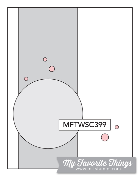
Lizzie’s rainbow stripe star card; its clean, graphic look appealed to me the most out of the cards from this release, and I have several ideas for how to translate it into my own supplies.


I also loved the look of 
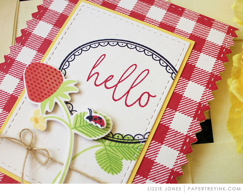
Lizzie’s red and yellow strawberry card, but I didn’t have any patterned paper or stamps that remotely resembled her supplies, so I condensed the elements of her card to their essence: red and white accented by yellow and green, several layers of frames, and a focal image framed in black. The framed image in PTI’s “Spring Hills” set perfectly fit the parameters, and I built the card around it. Since my Copic collection is limited, I didn’t have a suitable yellow-green, and the one lime marker available entirely washed out my yellow Copic, so I went with a more true green for contrast. Putting the focal image on a solid red base looked too flat, so I masked off a piece of cardstock in a plaid pattern and went over it with the same red Copic I had used for the roof of the house.


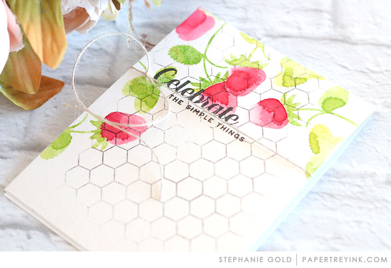
Stephanie’s simple, graphic strawberries card was my most direct translation, since I could very nearly match the colors and main font she used. I love the look of strawberries but don’t have any strawberry stamps yet, so I went with a flower silhouette and leaves and followed the layout of Stephanie’s card. Since I didn’t use the watercolor technique, the result isn’t as loose and organic as hers, but the graphic layout pleases me.


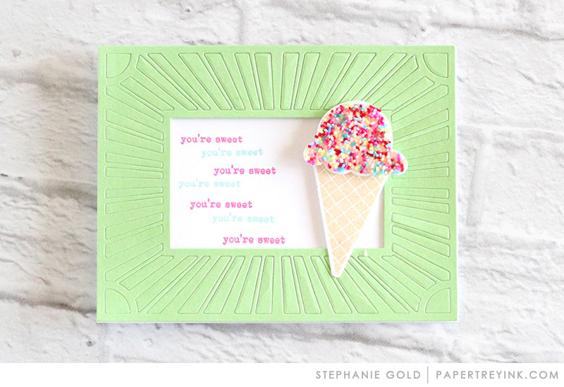
Stephanie’s fun mint and sprinkles card provided the perfect excuse for me to use my new sprinkle washi tape. This card was the quickest and easiest to make, though the result is much simpler than Stephanie’s since I don’t have coverplate dies or any large image that would coordinate with the theme. Instead, I focused on the color scheme and the theme.


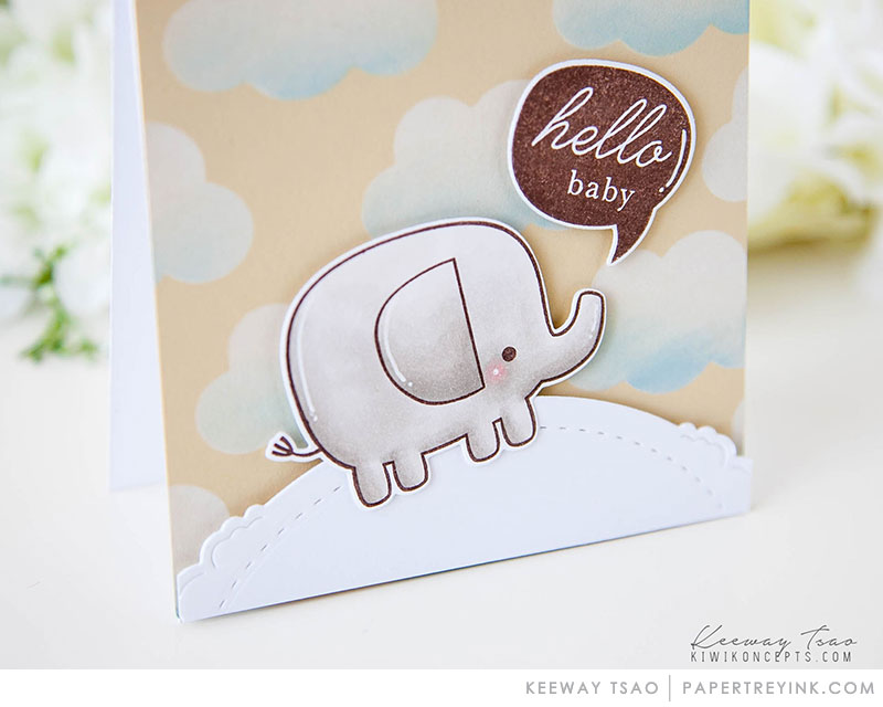
Keeway’s cute little animal card I used primarily as a sketch, since I haven’t any elephant or cloud stamps, but I do have a bunch of adorable little animals. I cut a peach panel to A1 size and layered on a hillside border, the cutest and chubbiest critter I could find, and a sentiment from PTI. The result feels a tad too simple, and it’d look better with some clouds, but one must work with what one has. Cloud dies have jumped much higher on my wish list, though!


Supplies
Stamps:  Papertrey Ink “Keep It Simple: Thank You I” (bold script), “Spring Hills” (framed hillside), “Just Desserts Sentiments” (“everything’s better...”), “Winter Woods” (“hello”);  WPlus9 “Fresh Cut Florals” (flower and leaves);  Hero Arts “Stamp and Cut: Thanks” (“for your kindness”);  Mama Elephant “Lunar Animals” (cow)
Ink:  Memento Tuxedo Black, Espresso Truffle;  VersaFine Vintage Sepia;  Hero Arts Pale Tomato, Green Hills, Bubble Gum;  VersaColor Cyan
Copics:  R27, Y00, G14, BG000, W00, and E43 (framed hillside); E34, E30, E0000 (cow);  Stampin’ Up Stampin’ Blendabilities: Crumb Cake Light, Crumb Cake Medium (cow)
Paper:  Papertrey Ink Stamper’s Select White; cheap layering-weight yellow, mint, and peach from stash
Miscellanea:  Scotch Permanent Double-Sided Tape, Pebbles Happy Hooray Birthday Wishes washi tape, Lawn Fawn “Stitched Hillside Borders” dies


Dimensions
All cards:  4.25” x 5.5”