Sunday, September 23, 2018

MFT Color Challenge #101

The palette of MFT’s color challenge this week seemed very wintry to me, so I broke out my new “Winter Hills” set, which I had been itching to use ever since I got it for my birthday. I stamped the image in teal ink rather than black to give a frostier feel to the trees and the snow-covered hills, and I used coral shades for the sky to evoke a December sunset. My lighter teal color veered away from the saturation of Summer Splash since I needed something very pale for the shadows giving dimension to the snow, but Copic BG000 fits the category of light aqua. The teal of the roofs is more green than the ink of the outlines, but since the palette is so narrow, the colors harmonize rather than competing—I hope! The red house and barn round out the tetrad, but it’ll be fun to try a less conventional color for them next time.


I applied clear shimmer to all the white spaces within the frame—glimmering snow was just the little something to take the super-simple card up a notch. The shimmer is arresting in person, but no matter how I tried, I couldn’t get the photos to represent it well in its entirety. Whenever the camera did succeed in capturing glitter, it would only catch one area rather than every snowbank. One day, I will manage to photograph glitter properly, but it is not this day.


Supplies
Stamps:  Papertrey Ink “Winter Hills”, “Vintage Picnic Sentiments”
Ink:  Memento Teal Zeal, Love Letter
Copics:  R27, BG000, 0;  Blendabilities Costal Cabana dark, Calypso Coral light, medium, and dark
Paper:  Papertrey Ink Stamper’s Select White
Miscellanea:  Scotch Permanent Double-Sided Tape, Spectrum Noir clear shimmer pen

Dimensions
4.25” x 5.5”

Monday, September 17, 2018

PTI’s “Create Along With Us” Challenge, September 2018, & MFT Sketch Challenge #402

This month’s Papertrey Ink release was heavily Christmas-themed, but since I’m not yet in the mode of making Christmas cards, I looked for inspiration that I could use for a more generally autumn- or winter-themed card for the Create Along With Us challenge.

What first drew me to 
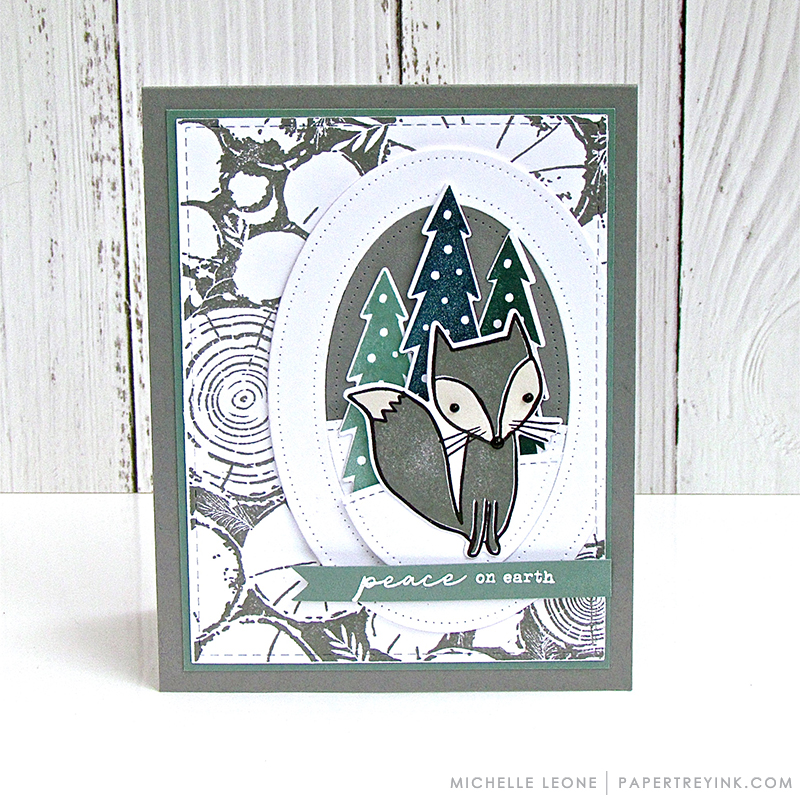
Michelle’s card was the color scheme, but the reason I ended up choosing it as my inspiration piece was the background, since I could emulate that with the large pine branch stamp from PTI’s “Winter Woods” set. I love the Ocean Tides ink color, but I haven’t anything like it (I’m going to have to get the cube during PTI’s anniversary sale next spring). The closest I could come to the color was Hero Arts Forever Green, and that’s definitely green, not greyish blue-green. Still, it works well for pine needles. In hindsight, I think perhaps the card would have been more cohesive if I had stamped the wood of the branches in grey rather than brown and if I had chosen lighter colors for the background, but at least the color of the branches is realistic.


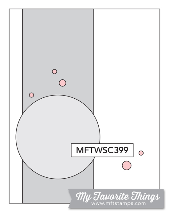
Although I have a fox stamp from a Stampin’ Up set, it’s horizontal, so I chose the chickadee from “Winter Woods” since it fit the vertical layout I was following from both Michelle’s card and this week’s MFT sketch challenge. Since the chickadee faces right, I flipped the sketch to accommodate it. The solid pine trees behind the chickadee are from the aforementioned SU set; I fussy-cut them and colored them with an alcohol marker to make the focal point bolder than the background.

For the banner, I smooshed a strip of cardstock against the Field Greens ink pad and let it dry overnight. It was still a bit splotchy when I went to stamp the sentiment, but at least it coordinates! The finished card is busier than I prefer; if I ever have time in the future, I’d like to tackle the design again with much lighter ink in the background. It might be fun to use the other birds from the same set—perhaps softer green pine branches for a background for the cardinal or pale grey snowflakes behind the bluejay.


Supplies
Stamps:  Papertrey Ink “Winter Woods”, “Vintage Picnic Sentiments”;  Stampin’ Up “Life in the Forest”
Dies:  Papertrey Ink “Winter Woods”;  My Favorite Things “A2 Stitched Rectangle STAX Set 2” (3 9/16” x 4 13/16”; 1 7/8” x 3 1/8”)
Ink:  Memento Tuxedo Black, Grey Flannel, Toffee Crunch, Northern Pine;  Hero Arts Field Greens;  Simon Says Stamp Fog
Paper:  Papertrey Ink Stamper’s Select White, cheap lightweight grey cardstock from my stash
Miscellanea:  Scotch Permanent Double-Sided Tape, Bic Marking Forever Green

Dimensions
4.25” x 5.5”

Wednesday, September 12, 2018

MFT Color Challenge #100

This card is my final entry for MFT’s one-hundredth color challenge, but it’s the first idea I had for the palette. The similar shades of blue brought to mind the gradation of blues that one sees in photos of misty mountain ridges, and that concept immediately paired with the backpack-wearing bear from Neat & Tangled’s “Schoolhouse” set. Who says he has to be headed to school—why not let him be a hiking bear?


I stamped him in a Copic-friendly brown ink so dark it tends to look black, then I fussy-cut him. Usually when I fussy-cut I’ll trim right along the stamped line, but since I don’t have a brown marker the right shade to color over the edges and I wanted an easier shape to cut out, I cut him with a border. To get a uniform margin, I cheated a bit: I laid the cleaned stamp over the image and lightly traced a pencil around the stamp, then used that as a guide for cutting.

None of the sentiments I have on hand seemed quite right for the card, so for now I’ve forgone a sentiment. Once I decide who I’m sending the card to, I might add a sentiment in Persimmon ink beneath the focal square. I think this would make a good encouragement card for someone setting out on an adventure, such as graduating school or getting a new job or embarking on a significant trip, but it would also work as a thank-you or birthday card for any of my mountain-dwelling relatives who like hiking—so we’ll see.


Supplies
Stamps:  Neat & Tangled “Schoolhouse” (bear)
Dies:  My Favorite Things “Inside and Out Stitched Square STAX” (2.75”)
Ink:  Memento Espresso Truffle
Copics:  E34, E43, E30;  Bic Marking Sunset Orange
Paper:  Papertrey Ink Stamper’s Select White, cheap lightweight blue cardstock from my stash
Miscellanea:  Scotch Permanent Double-Sided Tape

Dimensions
4.25” x 5.5”

Monday, September 10, 2018

MFT Sketch Challenge #401

A couple of weeks ago, I spotted this card by Larissa Heskett and fell in love with the color scheme. My sister’s birthday is approaching, and she loves pandas, so making her a card provided the perfect excuse for CASEing Larissa’s. This week’s sketch challenge from My Favorite Things suited the layout I had in mind, and I’m also submitting the card to MFT’s Birthday Project.


I stamped the flowers multiple times, two layers for the orange, three or four for the yellow, because I wanted deep colors as well as a solid impression to capture the details of the flowers. I drew in the stems and am not happy with them—it’ll be a while before I can freehand anything satisfactorily. Whatever I draw never quite conforms to the law of gravity, and the lack of realism bugs me, but the only way to improve is to practice, so I’m continuing my attempts and trying to convince myself that the wonky results are just going to look whimsical to anyone else.

I edged the matte in the same orange ink, just smooshing the cube onto the paper. The cheaper cardstock rippled a little as it dried, but my dictionary helped mitigate that somewhat, and the focal panel disguises the remaining undulations.


Supplies
Stamps:  Mama Elephant “Incoming Mail” (panda);  WPlus9 “Fresh Cut Florals”;  Papertrey Ink “Keep It Simple Birthday III” (sentiment)
Dies:  My Favorite Things “A2 Stitched Rectangle STAX Set 1”
Ink:  Memento Tuxedo Black;  My Favorite Things Dye Persimmon;  Hero Arts Butter Bar
Paper:  Papertrey Ink Stamper’s Select White, cheap lightweight white cardstock from my stash
Miscellanea:  Scotch Permanent Double-Sided Tape, Sakura Pigma Micron 01 (0.25 mm)

Dimensions
4.25” x 5.5”

Tuesday, August 28, 2018

MFT Sketch Challenge #399 & Color Challenge #100

I particularly like this fortnight’s color challenge—it’s a splendid palette for the one-hundredth challenge, and I’ve had so many ideas for how to use it. Practicality must come before sheer play, however, so I’m first applying the palette to cards for my grandmothers for Grandparents Day, which is Sunday, September 9.


Memento Toffee Crunch makes a good Kraft, and Memento Morocco stamped twice makes a good Persimmon, but I have no ink pads the right shade of blue. The closest I could get to Blue Yonder is VersaColor Atlantic, and that’s a bit too purple, and I have nothing at all near Blue Breeze. (A good range of blue ink cubes is next on my crafty wish list.) I’ve had a sheet of persimmon paper hanging around these past few weeks, hoping for a home on a card, and I found a light blue scrap of cardstock in my stash that’s near enough to Blue Breeze to round out the palette.


I also followed this week’s sketch challenge, and the circle element gave me a good way to ground and form the floral cluster. I’m still rubbish at arranging flowers—it takes me hours to find something that looks pleasing—but it’s so much easier to fiddle and find the right arrangement now that I have dies for them. Taking inspiration from Inge Groot and some other MFT designers, I went with white leaves, and I really like the simple silhouette look they give to a card.


Supplies
Stamps:  WPlus9 “Fresh Cut Florals”;  Hero Arts “Many Everyday Messages” (sentiment)
Dies:  WPlus9 “Fresh Cut Florals”;  My Favorite Things “Fab Foliage”, “A2 Stitched Rectangle STAX Set 1” (¾” x 2”);  Hero Arts “Nesting Circle Infinity Dies” (2.25” circle)
Ink:  VersaColor Atlantic, Smoke Blue;   Memento Morocco, Love Letter, Toffee Crunch
Paper:  Papertrey Ink Kraft, cheap light blue cardstock and persimmon origami paper from my stash
Miscellanea:  Scotch Permanent Double-Sided Tape, liquid glue

Dimensions
4.25” x 5.5”

Sunday, August 26, 2018

MFT Summer School: Monochromatic

Since I was running out of time last night to complete the second session of My Favorite Things Summer School, I abandoned my plans for a more elaborate take on a monochrome card, pulled out my dies, and whipped this up. The die-cut panel lets the colored cardstock base show through, and an auxiliary sentiment in matching ink finishes it off.


With that, I have graduated from the second session of Summer School.


Supplies
Stamps:  Hero Arts “Stamp and Cut: Hello” (sentiment)
Dies:  My Favorite Things “A2 Stitched Rectangle STAX Set 2” (4 x 5 ¼);  Hero Arts “Stamp and Cut: Hello” (sentiment)
Ink:  Hero Arts Butter Bar
Paper:  Papertrey Ink Stamper’s Select White, Lemon Tart
Miscellanea:  Scotch Permanent Double-Sided Tape, liquid glue

Dimensions
4.25” x 5.5”

MFT Summer School: Visual Triangle

For the visual triangle challenge of MFT Summer School, I balanced different colors and shapes in multiple triangles throughout a floral arrangement. There’s a triangle of purple, of coral four-petal flowers, and of one shape of stamped leaves. In a much looser sense, the Fab Foliage die-cuts behind the rectangle form a triangle as well, since they are concentrated in the top left corner, bottom edge, and right side.


This was my first chance to use the Fab Foliage dies, and I loved it. Even with only one use, I can tell that they’re well on their way to becoming a staple for me.


I’m also entering this card in MFT’s Birthday Project.


Supplies
Stamps:  WPlus9 “Fresh Cut Florals”;  Papertrey Ink “Keep It Simple: Birthday II” (sentiment)
Dies:  My Favorite Things “A2 Stitched Rectangle STAX Set 2” (1 ⅞” x 3 ⅛”), “Fab Foliage”;  WPlus9 “Fresh Cut Florals”
Ink:  Simon Says Stamp Dusty Sage;  Hero Arts Field Greens, Soft Cantaloupe, Pale Tomato;  Memento Lulu Lavender, Sweet Plum, Elderberry
Paper:  Papertrey Ink Stamper’s Select White
Miscellanea:  Scotch Permanent Double-Sided Tape, liquid glue

Dimensions
4.25” x 5.5”

Thursday, August 23, 2018

MFT Summer School: Ombré

Since I don’t have any tools for ink blending, I looked for other ways to achieve an ombré effect for the MFT Summer School challenge, but none of my outline stamps were speaking to me for the technique. Then I remembered Anja Bytyqi’s card that I had saved to my inspiration file, and that was the perfect layout—crisp, graphic, and very easy to pull together. I CASEd her card pretty closely, but I tried to change things up with different colors as well as different sentiments.


I layered the sentiment die-cuts twice for dimension, and this project persuaded me that I really do need more sentiment dies. I only have four Hero Arts Stamp and Cut words, which are small and a very loopy script, and this MFT “miss you” that I got as the free $60+ incentive with my order earlier this month. I’ve got my eye on a few of MFT’s sans serif word dies, as well as this alphabet die set from Cathy Zielske.


The strips on the blue card are ⅜” wide, and the strips on the yellow card are ½” wide, but they’re all spaced ⅛” apart from each other. The yellow stripes remind me a bit of a mug my parents had from the ’70s or ’80s—something about that deep yellow gradient seems reminiscent of the time period.


Supplies
Stamps and Dies:  My Favorite Things “miss you” die;  Hero Arts “Stamp and Cut: Joy” (die, stamp)
Ink:  Memento Morocco
Paper:  Papertrey Ink Stamper’s Select White, cheap colored paper from my stash
Miscellanea:  Scotch Permanent Double-Sided Tape, liquid glue

Dimensions
4.25” x 5.5”

Tuesday, August 21, 2018

MFT Summer School: Rainbow

For the rainbow challenge from MFT Summer School, I whipped up a super-simple graphic card. I love sans serif fonts for designs like these—really, I just love simple cards that rely entirely on a good font. My stamping platform enabled me to stamp in precise increments and make sure each word had adequate ink coverage; I’d never be able to do designs like this without a platform!


Employing the graphic design principle of using lighter colors for weightier fonts and darker colors for thinner fonts to achieve visual balance, I selectively inked the stamp in a jewel-tone rainbow on the left and a pastel rainbow on the right. I love ink cubes—full-size ink pads are so unwieldy!—but Memento’s dewdrop design is unequaled. The difference between the dewdrops and the cubes was starkly apparent using them together like this; the dewdrops offer so much more precision, and they’re much easier to grip and maneuver.


Supplies
Stamps:  Papertrey Ink “Keep It Simple: Thank You I
Ink:  Memento Teal Zeal, Grape Jelly, Lulu Lavender, Love Letter, Morocco, Peanut Brittle, Olive Grove, Pistachio;  Hero Arts Cotton Candy, Soft Cantaloupe, Butter Bar;  VersaColor Celadon, Atlantic;  Brilliance Mediterranean Blue
Paper:  Papertrey Ink Stamper’s Select White

Dimensions
4.25” x 5.5”

MFT Color Challenge #99 & The Birthday Project

The former youth pastor at my church and I happen to have the same birthday, and he was so ecstatic when he found out that he shared a birthday with someone that ever since I’ve made a point of giving him a card every year. He’s something of a comic, so this sentiment from My Favorite Things seemed quite suitable.


I’m playing along with the MFT Color Challenge #99—I jumped at the chance to use persimmon again—and I’m also entering MFT’s Birthday Project. This month’s theme is Clean and Simple, which perfectly suits my style.


Supplies
Stamps:  My Favorite Things “Hog Heaven” (sentiment);  Mama Elephant “Little Cat Agenda
Ink:  Memento Tuxedo Black
Copics:  W00, W1, W3, E43, E34, R27;  Bic Marking Sunset Orange, Moonstone Yellow
Paper:  Papertrey Ink Stamper’s Select White
Miscellanea:  Scotch Permanent Double-Sided Tape; Mama Elephant “Little Cat Agenda” dies

Dimensions
3.5” x 4.75”